
Ask the Plant Editors: What font should I use?
This month’s featured question comes from one of our authors.
“In United States, which font style and size should I use, or which font style and size is popular?”
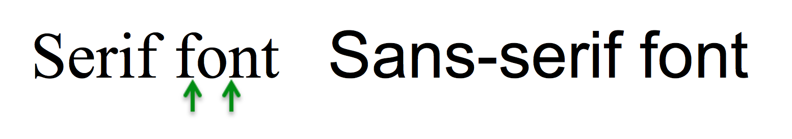
Thanks for the great question! Fonts come in two general types, depending on whether they have serifs– these are the little “feet” on the letters. Fonts without serifs are known as sans-serif fonts– Arial and Helvetica are the most typically used sans-serif fonts. Here’s an example of a serif font (Times New Roman) and a sans-serif font (Arial), both in 32-point type. The green arrows point to two of the serifs.
Fonts for manuscript text: Conventional wisdom states that serif fonts are easier to read, especially in print, but most modern fonts have been designed for readability, particularly on the computer screen. For submitting manuscripts, we generally use Times New Roman, although other acceptable fonts include Century Schoolbook, Garamond, and Palatino. Check out this Writing Guide post by Mark Womak for more advice. You could even try to mimic the journal’s final look by using a sans-serif font. Just don’t use anything wacky. For example, some fonts are considered unprofessional— “Comic Sans” is considered silly and Papyrus may be considered kitsch or fake antique. Don’t use these.
For appearance, make sure that your font is consistent in size and type throughout. This is one of the many things we check for you at Plant Editors! If you want help polishing your manuscript, get started here!
For titles and subheadings, we suggest using the same font type and style as the rest of the text, but in bold or italics (as needed). Having text that switches to a different font looks sloppy– and if your font looks sloppy, the reviewers might wonder (consciously or not) whether your science is sloppy too.
Fonts for specialty applications:
Equations: If your equations are too complex to write using standard fonts (including Symbol), use Word’s equation editor or LaTeX (this is preferred if you have a lot of equations).
Symbols: Use symbol font (via “insert symbol”), as other fonts may not convert correctly. Remember to insert the correct symbols in each case (e.g., the authentic degree symbol).
Amino acid and nucleic acid sequences: In most fonts, different letters have different widths. If you need letters to align, use a monospaced (fixed-width) font, such as Courier.
Fonts for your figures: Figure labels should be crisp and easy to read. Sans-serif fonts like Arial and Helvetica are good choices for figures, since they match the final text in most journals. Journals generally use sans-serif fonts because they look clean and high-tech, or possibly because they take up less space. The alert reader will also notice in the example above that, although both phrases are in the same size type, they look very different. For professional-looking figures, stick to one font type and size throughout. We often see differences in font between panels of a single figure, and the overall effect is shoddy.
What do the journals have to say about font choices? We surveyed the Instructions for Authors of several journals that our clients frequently publish in, and here’s what we found:
Science: “Lettering in Helvetica font is preferable for figures”…”For best conversion, we recommend use of Times and Symbol fonts only.”
Nature: “We prefer the use of a ‘standard’ font, preferably 12-point Times New Roman.”..”Amino-acid sequences should be printed in Courier (or other monospaced) font using the one-letter code in lines of 50 or 100 characters.”
PNAS: Not specified.
Cell: For figures: “Different panels should be labeled with capital letters, and Helvetica or Arial font should be used for any text.” For graphical icons: “Font: Arial, 12–16 points. Smaller fonts will not be legible online.”
The Plant Cell: “Acceptable fonts: Arial, Times New Roman, Symbol font (for Greek characters)”…. “Use the same type and size of sans serif font for all of your figures (Arial at a minimum 8 pt size is recommended).”
PLoS: “Use any standard font and a standard font size.”
Do you have a question for the Plant Editors? Email us at info@planteditors.com or use the contact form. We’d love to hear from you!